simple

SVG + CSS loader

A concentric circles loader (spinner, throbber).

<svg width="42px" height="42px" viewBox="0 0 42 42" version="1.1" xmlns="http://www.w3.org/2000/svg">
  <style type="text/css">
    @keyframes fadeIn1 {
      0% {
        opacity: 0;
      }
      25% {
        opacity: 1;
      }
      50% {
        opacity: 1;
      }
      100% {
        opacity: 1;
      }
    }
    @keyframes fadeIn2 {
      0% {
        opacity: 0;
      }
      25% {
        opacity: 0;
      }
      50% {
        opacity: 1;
      }
      100% {
        opacity: 1;
      }
    }
    @keyframes fadeIn3 {
      0% {
        opacity: 0;
      }
      50% {
        opacity: 0;
      }
      75% {
        opacity: 1;
      }
      100% {
        opacity: 1;
      }
    }
    @keyframes fadeIn4 {
      0% {
        opacity: 0;
      }
      50% {
        opacity: 0;
      }
      75% {
        opacity: 0;
      }
      100% {
        opacity: 1;
      }
    }
    .circle-1 {
      animation: fadeIn1 1.2s ease infinite;
    }
    .circle-2 {
      animation: fadeIn2 1.2s ease infinite;
    }
    .circle-3 {
      animation: fadeIn3 1.2s ease infinite;
    }
    .circle-4 {
      animation: fadeIn4 1.2s ease infinite;
    }
  </style>
  <circle class="circle-1" stroke="#C22929" fill="none" cx="21" cy="21" r="5"></circle>
  <circle class="circle-2" stroke="#CCAD6D" fill="none" cx="21" cy="21" r="10"></circle>
  <circle class="circle-3" stroke="#9DCB11" fill="none" cx="21" cy="21" r="15"></circle>
  <circle class="circle-4" stroke="#11CB28" fill="none" cx="21" cy="21" r="20"></circle>
</svg>

CSS only slide out menu

Neat trick to toggle the display of something in the page, using only CSS. In this case, a slide out menu.

First we need the HTML:

<input id="menu-toggle" type="checkbox">
<label class="menu-trigger" for="menu-toggle"></label>
<nav id="menu">
  <ul>
    <li>
      <a href="">Menu Item</a>
    </li>
  </ul>
</nav>

Use the “:checked” pseudo-class, to check the state of the menu (open/close).
Hide the checkbox input, as it is not vissually needed, and style the label as a menu button.

#menu {
  width: 100%;
  position: fixed;
  right: -100%; /* move the menu out of the screen */
  top: 0;
  bottom: 0;
  overflow-y: auto;
  transition: all 1s cubic-bezier(0.2, 1, 0.2, 1) 0s;
  z-index: 999;
}

#menu-toggle {
  position: absolute;
  left: 0;
  top: 0;
  opacity: 0;
  visibility: hidden;
}

#menu-toggle:checked ~ #menu {
  right: 0; /* add the menu into the screen */
}

.menu-trigger {
  /* Closed menu style ☰ */
}

#menu-toggle:checked ~ .menu-trigger {
  /* Opened menu style × */
}

Simple HTML5 placeholders fallback for IE9 and older

I hoped I will never hear about IE9 and its lack of support for the placeholder attribute, … I had high hopes.

I’ve boiled a simple fallback, late in the evening and in a rush, using IE conditional comments for browser detection.

<!--[if IE 8 ]>    <html class="ie8 lt-ie10"> <![endif]-->
<!--[if IE 9 ]>    <html class="ie9 lt-ie10"> <![endif]-->
<!--[if (gt IE 9)|!(IE)]><!--> <html><!--<![endif]-->
$(document).ready(function() {

	// HTML5 placeholders fallback for IE9 and older
	if ($('html').hasClass('lt-ie10')) {

		// add the placeholder text as value
		$('textarea, input:text').each(function() {
			$(this).attr('value', $(this).attr('placeholder'));
		});

		// clear form fields on focus
		$('textarea, input:text').on('focus click', function(){
			if (this.value == this.defaultValue) {
			this.value = '';
			}
		}).on('blur', function(){
			if (this.value == '') {
			this.value = this.defaultValue;
			}
		});
	}

});

Network cable tester

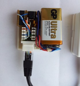
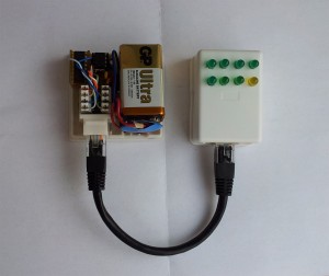
Build a network cable tester with just two cheap integrated circuits and a few parts from the ‘junkbox’.
This cable tester, tests all the 8 wires in a network cable in one move, if one of the 8 LEDs does not lit up, it means that the wire corresponding to that LED is faulty.

You need:

  • 1 x 4017 decade counter,
  • 1 x 555 timer,
  • 8 x LEDs,
  • 2 x 8P8C modular connector (RJ45),
  • 8 x 100Ω resistor,
  • 1 x 10KΩ resistor,
  • 1 x 15KΩ resistor,
  • 1 x 4,7µF capacitor.

network-tester

The yellow LED has no special significance, I only had 7 green LEDs.

A good ideea would be that every LED have the color of the corresponding wire, and maybe a switch for the T568A and T568B standards.

Slide out hamburger menu

It is known that the slide out menus ( or hamburger menus ) are the best way of making a menu usable for mobile.

This method uses jQuery in order to clone the markup of the desktop version menu, and make it slide out. Check out the demo.

<body>
	<div id="container">
		<div id="header">
			<div id="navigation">
				<ul>
					<li>
						<a href="#">Lorem Ipsum</a>
					</li>
					<li>
						<a href="#">Lorem Ipsum</a>
					</li>
				</ul>
			</div>
			<span id="toggle-menu">Menu</span>
		</div>
	</div>
</body>
$('#navigation').clone().prependTo('body').addClass('mobile-navigation').removeAttr('id');
$('div.mobile-navigation').prepend('<span class="close">Close</span>');

$('#toggle-menu').bind('click touch', function(){
	if( $('div.mobile-navigation').hasClass('open') ){
		$('div.mobile-navigation').animate({width: "0px"}, 300).removeClass('open');
		$('#container').animate({left: "0px"}, 300);
	} else {
		$('div.mobile-navigation').animate({width: "210px"}, 300).addClass('open');
		$('#container').animate({left: "-210px"}, 300);
	}
});

$('div.mobile-navigation span.close').bind('click touch', function(){
	$('div.mobile-navigation').animate({width: "0px"}, 300).removeClass('open');
	$('#container').animate({left: "0px"}, 300);
});
#container {
  position: relative;
  width: 100%;
}

.mobile-navigation {
  width: 0;
  height: 100%;
  overflow: hidden;
  position: fixed;
  right: 0;
  top: 0;
  z-index: 200;
}

Check out demo.

Quick and simple jQuery accordion

A simple jQuery snippet for those times when you don’t need an entire plugin, but just something quick, and on the spot.

<ul class="accordion">
	<li>
		<div class="heading">Lorem ipsum dolor</div>
		<div class="content">
			Lorem ipsum dolor sit amet...
		</div>
	</li>
</ul>
//accordion
$('.accordion .content').hide();

$('.accordion .heading').click(function(){
	$(this).siblings('.content').slideToggle('fast');
	$(this).parent().toggleClass('active');
	$(this).parent().siblings().children('.content:visible').slideUp('fast');
	$(this).parent().siblings().children('.content:visible').parent().removeClass('active');
});

See demo here.

jQuery toggle functions

The toggle() method was deprecated in jQuery 1.8 and removed in 1.9.
In jQuery 1.9 the toggle() method does not toggle between two or more functions on a click event, it just toggles the visibility of an element.

Here is a quick way of replacing it:

var toggle = 0;
$('#toggle-btn').on('click', function(event) {
	event.preventDefault();
	if ( toggle == 1 ){
		// not clicked
		$(this).removeClass('clicked');
		toggle = 0;
	} else {
		// clicked
		$(this).addClass('clicked');
		toggle = 1;
	}
});

or just using a class,

$('#toggle-btn').on('click', function(event) {
	event.preventDefault();
	if ( $(this).hasClass('active') ) {
		$(this).removeClass('active');
	} else {
		$(this).addClass('active');
	}
});

See demo here.

Custom select input

Using some jQuery and CSS you can make a cross-browser custom select (dropdown) box.

<div class="select-wrapper">
    <select>
        <option selected="selected" value="1">Option 1</option>
        <option value="2">Option 2</option>
        <option value="3">Option 3</option>
        <option value="4">Option 4</option>
        <option value="5">Option 5</option>
    </select>
</div>
.select-wrapper {
  position: relative;
  width: 215px;
  height: 30px;
  padding: 0 25px 0 0;
  margin: 0;
  border: 1px solid #0D5995;
  overflow: hidden;
  background: url(select-arrow.png) no-repeat right center transparent;
}

select {
  position: absolute;
  left: 0;
  top: 0;
  opacity : 0;
  width: 240px;
  height: 30px;
  padding: 5px 0;
  border: none;
  background: transparent !important;
  -webkit-appearance: none;
}

.select-wrapper span {
  display: block;
  width: 210px;
  height: 30px;
  line-height: 30px;
  padding: 0 0 0 5px;
}
$(document).ready(function() {
  $('select').after('<span>' + $('option:selected', this).text() + '</span>');
  
  $('select').click(function(event) {
    $(this).siblings('span').remove();
    $(this).after('<span>' + $('option:selected', this).text() + '</span>');
  });
})

See the demo.

How to move WP database to new domain without sql queries

It happened that i needed to move a wordpress site from one domain to another, all simple, move the files, export the database, make a search and replace for the site’s url and replace it with the new url, then import the DB and all should be fine, …except that all the text widgets were missing. It seems like, the text widgets have serialized data stored in sql, so a blind find/replace messed up the data.

You could use a tool that handles serialized data to do a find/replace, but wordpress makes it easy, and you can add just to lines to the wp-config.php file and you’re done.

define('WP_HOME','http://new-domain-path');
define('WP_SITEURL','http://new-domain-path');

WordPress registration form in a regular page

Note: This code is old, and it may not work with the latest versions of WordPress

WordPress provides a function to echo in front end a simple login form (  wp_login_form( $args ) ), but it doesn’t provide a simple way to embed the registration form ( the form displayed in /wp-login.php?action=register ) in a regular page or sidebar.

After some google-ing and trying a few plugins, i decided it is more flexible if i make one myself. In my research to do this I stumble upon this article here which is the base of what i will explain below.

Make your own WordPress registration form:

Step 1

Create a file called ‘registration_form.php’ in your theme in which paste the code below.

<div class="registration-form-wrapper">
<?php
/* the captcha result is stored in session */
session_start();

if( isset( $_POST['svalue'] ) ) {
	if($_POST['svalue'] != $_SESSION['answer']) {
		$matherror = "Wrong math!";
	}
	else {
		$matherror = " ";
	}
}

include('arithmetic_captcha.php');

if(defined('REGISTRATION_ERROR')){
    foreach(unserialize(REGISTRATION_ERROR) as $error){
	echo '<p class="error">'.$error.'</p';
    }
} elseif(defined('REGISTERED_A_USER')){
	echo '<p class="success">Successful registration, an email has been sent to '.REGISTERED_A_USER .'</p>';
}
echo '<p class="error">'. $matherror .'</p>';
?>

  <form id="my-registration-form" method="post" action="<?php echo add_query_arg('do', 'register', get_permalink( $post->ID )); ?>">
    <ul>
	<li>
	    <label for="username">Username</label>
	    <input type="text" id="username" name="user" value=""/>
	</li>
	<li>
	    <label for="email">E-mail</label>
	    <input type="text" id="email" name="email" value="" />
	</li>
	<li>
	    What is the result <strong><?php echo $math;?></strong> ? &nbsp; <input type="text" name="svalue" value="" size="7" />
	</li>
	<li>
	    <input type="submit" value="Register" />
	</li>
    </ul>
  </form>
</div>

This is basically the HTML of the form.

Step 2

Add the ‘register user’ function, which you will find below, to your theme’s ‘functions.php‘ file, ..this will register the user and validate the form.

add_action('template_redirect', 'register_a_user');
function register_a_user(){

  if(isset($_GET['do']) && $_GET['do'] == 'register'):
    $errors = array();
    if(empty($_POST['user']) || empty($_POST['email'])) $errors[] = 'Please enter a user name and e-mail.';

    $user_login = esc_attr($_POST['user']);
    $user_email = esc_attr($_POST['email']);

    $sanitized_user_login = sanitize_user($user_login);
    $user_email = apply_filters('user_registration_email', $user_email);

    if(!is_email($user_email)) $errors[] = 'Invalid e-mail.';
    elseif(email_exists($user_email)) $errors[] = 'This email is already registered.';

    if(empty($sanitized_user_login) || !validate_username($user_login)) $errors[] = 'Invalid user name.';
    elseif(username_exists($sanitized_user_login)) $errors[] = 'User name already exists.';

    if(empty($errors)):
      $user_pass = wp_generate_password();
      $user_id = wp_create_user($sanitized_user_login, $user_pass, $user_email);

      if(!$user_id):
        $errors[] = 'Registration failed';
      else:
        update_user_option($user_id, 'default_password_nag', true, true);
        wp_new_user_notification($user_id, $user_pass);
      endif;
    endif;

    if(!empty($errors)) define('REGISTRATION_ERROR', serialize($errors));
    else define('REGISTERED_A_USER', $user_email);
  endif;
}

Step 3

Create a file called ‘arithmetic_captcha.php‘ which will contain a simple random numbers generator, for a simple ‘math captcha’ to keep the spam away. This simple captcha can be used with other forms as well, …just use the code below and the check made at Step 1.

<?php
session_start();

$nr1 = mt_rand(1,10); //mt_rand($min, $max)
$nr2 = mt_rand(1,10);
if( $nr1 > $nr2 ) {
	$math = "$nr1 - $nr2";
	$_SESSION['answer'] = $nr1 - $nr2;
} else {
	$math = "$nr1 + $nr2";
	$_SESSION['answer'] = $nr1 + $nr2;
}

Step 4

Just include the ‘registration_form.php’ file created at Step 1 in your page template or wherever you want the form to appear.

<?php include('registration_form.php');?>

Or you can just download the files here (wp_registration_form.zip) and include them in your theme.

Simple confirm password or email validation

If you have a form with a ‘confirm password’ field or ‘confirm email’, and you don’t want to use a heavy validation plugin just for a simple confirmation like this, you can always use some simple ‘old school’ javascript and the onblur event, so when the field loses focus triggers the validation function.

<script type="text/javascript">
	function confirmPass() {
		var pass = document.getElementById("pass").value
		var confPass = document.getElementById("c_pass").value
		if(pass != confPass) {
			alert('Wrong confirm password !');
		}
	}
</script>
<form id="form" action="" method="post">
    <label for="pass">Password</label>
    <input type="password" id="pass" class="text" name="your_pass" value=""/>
    <label for="c_pass">Confirm Password</label>
    <input type="password" id="c_pass" class="text" name="your_c_pass" value="" onblur="confirmPass()"/>
</form>

See a demo.

Checkbox tree with jQuery

Update:

With nothing to do, I remembered the failure with the checkbox tree, and I started re-thinking it. With nothing else on my mind, took me very short time to figure my mistakes; …so now i will update this post and the demo. Of course my opinion about checkboxtree jQuery plugin remains the same, but if you don’t want to use an entire plugin, then you can always use the code here.


Sometime ago I needed an “checkbox tree” ( a nested list with checkboxes in every node ), for options that have sub-options. I decided to write one of my own.

After some try & error, I come up with the following code :

Below is the new improved and corrected code.


(function($){

$('ul#checkboxes input[type="checkbox"]').each (
 function () {
  $(this).bind('click change', function (){
   if($(this).is(':checked')) {
    $(this).siblings('ul').find('input[type="checkbox"]').attr('checked', 'checked');
    $(this).parents('ul').siblings('input[type="checkbox"]').attr('checked', 'checked');
   } else {
    $(this).siblings('ul').find('input[type="checkbox"]').removeAttr('checked', 'checked');
   }
  });
 }
);

})(jQuery);

you can see it in action here. (updated demo, with the new code).

I also found this checkboxtree jQuery plugin . I gave it a try, and worked perfectly, and you just have to write:

$('ul#checkboxes').checkboxTree({ });

and you will have a checkboxtree. This plugin has a lot of options, that you will find on the plugin homepage.

I made a simple demo using the plugin, that you can see it here, but you can see a lot more here.

jQuery title tooltip

If you need a simple way to replace the anchor’s ( <a href=”” ></a> ), title=”” attribute with a nice customizable tooltip, below is the code and a demo.

The script adds a html <div> at the end of the <body> tag, and as you hover the specified elements it get’s the title attribute and include it in the <div id=”tooltip”>, the last part of the script is what makes the tooltip move along with mouse cursor.

The nice part is that you can make your tooltip look however you want with CSS.


<ul id="links">
 <li>
   <a href="#" title="This is one">One</a>
 </li>
 <li>
   <a href="#" title="This is two">Two</a>
 </li>
 <li>
   <a href="#" title="This is three">Three</a>
 </li>
 <li>
   <a href="#" title="This is four">Four</a>
 </li>
 <li>
   <a href="#" title="This is five">Five</a>
 </li>
</ul>


#tooltip {
 padding: 10px 15px;
 position: absolute;
 font-size: 14px;
 color: #4E4E4E;
 background: #C4E424;
 z-index: 10;
}


(function($){
	$('body').append('<div id="tooltip"></div>');
	$('#tooltip').hide();
	var $tooltip = $('#tooltip');
    $('ul#links a').each(function(){
        var $this = $(this),
			$title = this.title;
			
        $this.hover(function(){
			this.title = '';
			$tooltip.text($title).show();
        }, function(){
			this.title = $title;
			$tooltip.text('').hide();
        });
		
		$this.mousemove(function(e){
			$tooltip.css({
				top: e.pageY - 10,
				left: e.pageX + 20
			});
		});
    });
})(jQuery);

Here is a demo