containerElement = document.getElementById('id');

focusableElements = [
    ...containerElement.querySelectorAll('a[href], button, input, textarea, select, details, [tabindex]:not([tabindex="-1"])')
  ].filter(
    el => (el.offsetParent != null) && el => !el.hasAttribute('disabled') && !el.getAttribute('aria-hidden')
);

firstFocusableEl = focusableElements[0];
lastFocusableEl = focusableElements[focusableElements.length - 1];

lastFocusableEl.addEventListener('keydown', function(event) {
  if (event.shiftKey === false && event.key === 'Tab') {
    event.preventDefault();
    firstFocusableEl.focus();
  }
});

firstFocusableEl.addEventListener('keydown', function(event) {
  if (event.shiftKey === true && event.key === 'Tab') {
    event.preventDefault();
    lastFocusableEl.focus();
  }
});
JS Trap focus
SVG + CSS loader
A concentric circles loader (spinner, throbber).
<svg width="42px" height="42px" viewBox="0 0 42 42" version="1.1" xmlns="http://www.w3.org/2000/svg">
  <style type="text/css">
    @keyframes fadeIn1 {
      0% {
        opacity: 0;
      }
      25% {
        opacity: 1;
      }
      50% {
        opacity: 1;
      }
      100% {
        opacity: 1;
      }
    }
    @keyframes fadeIn2 {
      0% {
        opacity: 0;
      }
      25% {
        opacity: 0;
      }
      50% {
        opacity: 1;
      }
      100% {
        opacity: 1;
      }
    }
    @keyframes fadeIn3 {
      0% {
        opacity: 0;
      }
      50% {
        opacity: 0;
      }
      75% {
        opacity: 1;
      }
      100% {
        opacity: 1;
      }
    }
    @keyframes fadeIn4 {
      0% {
        opacity: 0;
      }
      50% {
        opacity: 0;
      }
      75% {
        opacity: 0;
      }
      100% {
        opacity: 1;
      }
    }
    .circle-1 {
      animation: fadeIn1 1.2s ease infinite;
    }
    .circle-2 {
      animation: fadeIn2 1.2s ease infinite;
    }
    .circle-3 {
      animation: fadeIn3 1.2s ease infinite;
    }
    .circle-4 {
      animation: fadeIn4 1.2s ease infinite;
    }
  </style>
  <circle class="circle-1" stroke="#C22929" fill="none" cx="21" cy="21" r="5"></circle>
  <circle class="circle-2" stroke="#CCAD6D" fill="none" cx="21" cy="21" r="10"></circle>
  <circle class="circle-3" stroke="#9DCB11" fill="none" cx="21" cy="21" r="15"></circle>
  <circle class="circle-4" stroke="#11CB28" fill="none" cx="21" cy="21" r="20"></circle>
</svg>
Get the text node of an element
var h1_text = $('h1').contents().filter(function() { return this.nodeType === Node.TEXT_NODE; }).text();<h1>Lorem ipsum <span>dolor sit amet</span><h1>
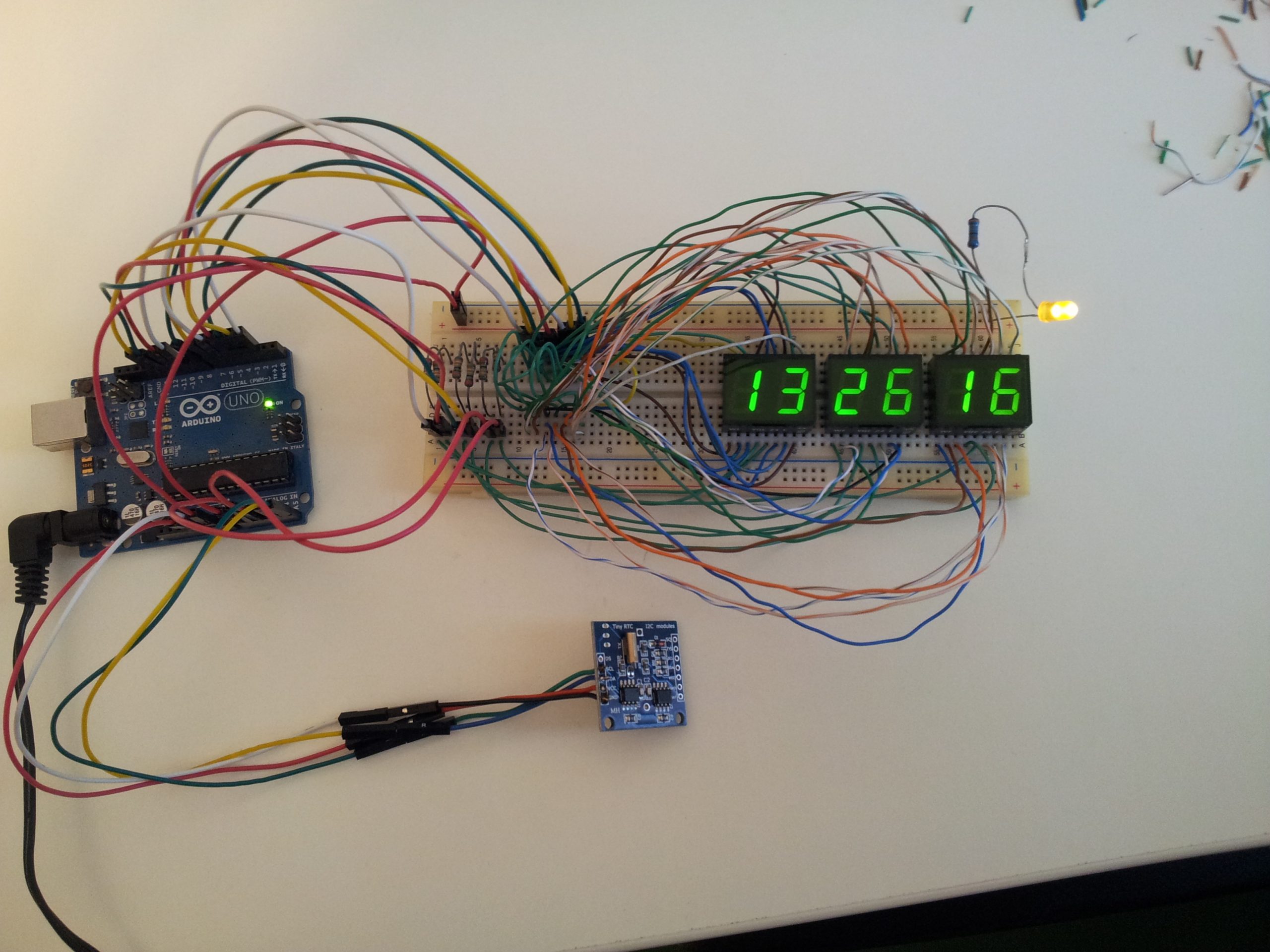
// console.log(h1_text) -> "Lorem ipsum"Arduino Uno 6 digit clock
I had an arduino uno and some modules laying around for some time, and finally I decided to make it a weekend project and put it to useful work, by building a clock that could display the time in HH:MM:SS format.
Digging the web for inspiration, I found many examples that involved an extra 74HC595 shift register and a BCD to 7-segment decoder and a RTC (real time clock) module for greater accuracy.
I had a DS1307RTC module, the problem was that the only 7-segment decoder I found in the junkbox was a CD4511 which can only drive common-cathode dispays, and the displays I had where VQE24E common-anode.
I could’ve added transistors, but for 6 digits there would’ve been a lot of transistors and resistors.
In the end I found about SevSeg.h library, that makes it posibble to drive both common-cathode as well as common-anode displays easily, directly from arduino.
I took inspiration from here for the code: https://electronics-project-hub.com/arduino-7-segment-display-clock-with-and-without-rtc/
Below is my modified code and circuit diagram:
#include "SevSeg.h"
#include <Wire.h>
#include <TimeLib.h>
#include <DS1307RTC.h>
SevSeg Display;
const int ledPin =  A0;
unsigned long timeDisplay;
unsigned long currentMillis;
unsigned int Hour;
int ledState = LOW;
unsigned long previousMillis = 0;
const long interval = 500;
void setup()
{
  pinMode(ledPin, OUTPUT);
  byte numDigits = 6;
  byte digitPins[] = {10, 11, 12, 13, A1, A2};
  byte segmentPins[] = {2, 3, 4, 5, 6, 7, 8, 9};
  bool resistorsOnSegments = false; // false = resistors are on digit pins
  bool updateWithDelaysIn = true;
  byte hardwareConfig = COMMON_ANODE;
  Display.begin(hardwareConfig, numDigits, digitPins, segmentPins, resistorsOnSegments);
  Display.setBrightness(100);
}
void loop()
{
  unsigned long currentMillis = millis();
  if (currentMillis - previousMillis >= interval)
  {
    previousMillis = currentMillis;
    if (ledState == LOW)
    {
      ledState = HIGH;
    }
    else
    {
      ledState = LOW;
    }
    digitalWrite(ledPin, ledState);
  }
  tmElements_t tm;
  if (RTC.read(tm))
  {
    Hour = tm.Hour;
    if (tm.Hour == 0)
    {
      Hour = 24;
    }

    timeDisplay = (Hour * 100 + tm.Minute) * 100L + tm.Second;
  }
  else {
    timeDisplay = 888888; // error
  }
  Display.setNumber(timeDisplay);
  Display.refreshDisplay();
}
In the end I didn’t use the blinking seconds LED, but left the option there.

To set the time on the DS1307 RTC, I followed the instructions in the link above.
On the breadboard there are anode resistors, but I ended up not using them. These displays needed some higher current to lit up well during the day.
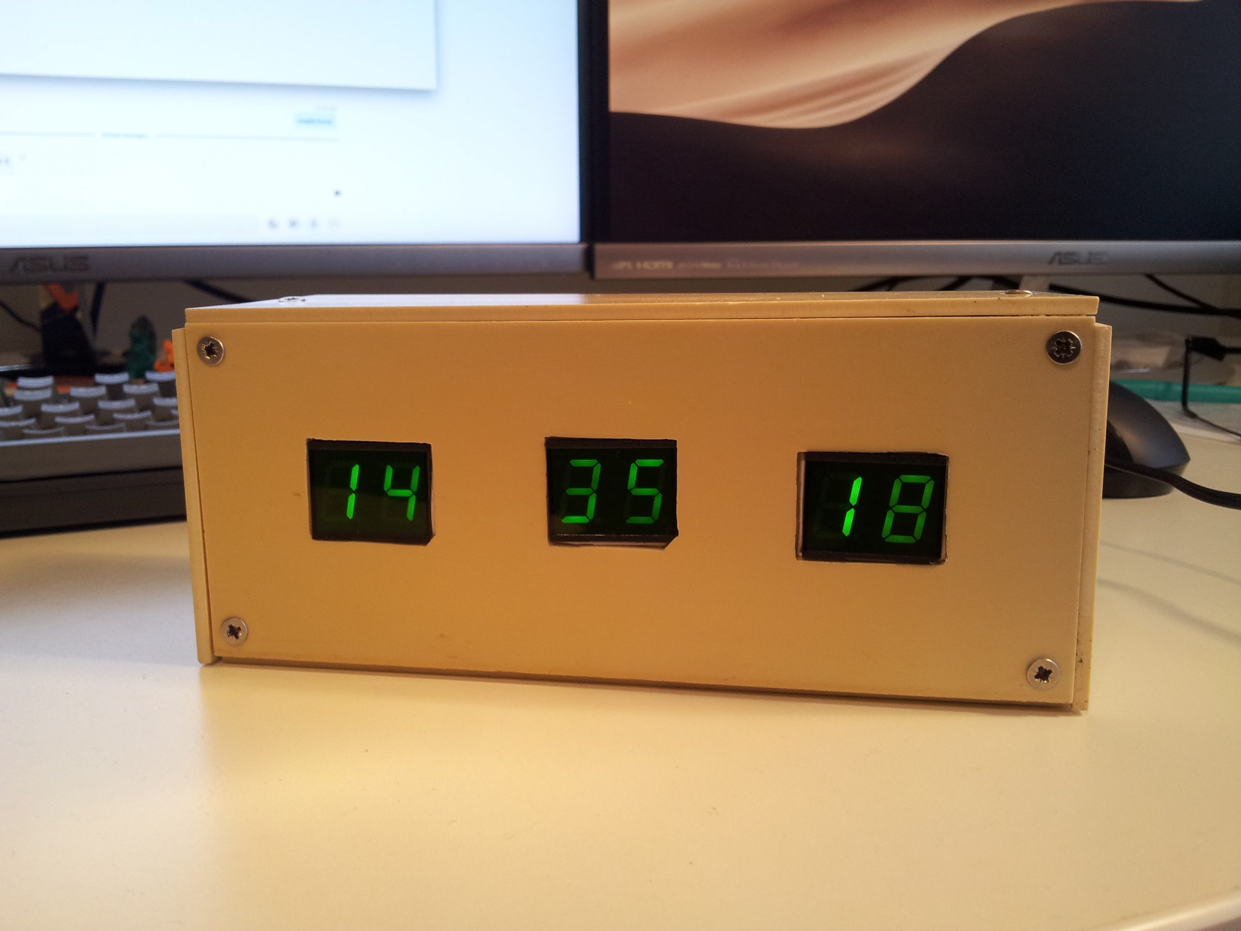
I know the box isn’t the prettiest one, but at least it’s a box :)
Later edit (12 june 2020):
It seems that the DS1307 RTC (at leas the one I have) is not so “real”… the clock gained over 60 seconds in almost three weeks. Not very accurate for a clock crystal.
Automatically add line breaks in SVG text
Add line breaks in SVG text with jQuery, based on a separator. In the example below the separator is plain text <br>.
<div class="svg-container">
  <svg version="1.1" xmlns="http://www.w3.org/2000/svg" xmlns:xlink="http://www.w3.org/1999/xlink">
    <text>
      <tspan x="0" y="0" style="font-family: Helvetica; font-size: 8px;">Lorem ipsum <br> dolor sit amet</tspan>
    </text>
  </svg>
</div>
$('.svg-container').each(function() {
  // line breaks
  $(this).find('text').each(function() {
    if (/<br>/i.test($(this).text())) {
      var tspan = $(this).find('tspan:first-child');
      var tspanX = tspan.attr('x');
      var tspanY = tspan.attr('y');
      var tspanStyle = tspan.attr('style');

      tspan.hide();

      var lines = $(this).text().split('<br>');
      var lineHeight = parseFloat(tspan.css('fontSize'));
      for (var i = 0; i < lines.length; ++i) {
        $(this).append('<tspan x="'+ tspanX +'" y="'+ (parseFloat(tspanY) + (lineHeight * i)) +'" style="'+ tspanStyle +'">'+ $.trim(lines[i]) +'</tspan>');
      }
    }
  });

  // refresh svg
  $(this).html($(this).html());
});
If in view
Check if an element is in view using only JQuery.
A sort of poor man’s Waypoints.
$(window).on('load scroll', function() {
  $('.element').each(function() {
    if ( $(this).offset().top <= ($(window).scrollTop() + $(window).height()/2)) {
     // in view (in the upper half of the screen)
    } else {
     // not in view
    }
  });
});
Using fullPage.js to make a vertical split-screen parallax
fullPage.js, as its author states, is a jQuery plugin which allows you to “create full screen pages fast and simple”.
How about using it to make a split-screen parallax fast and simple ?
First the required HTML structure:
<div id="splitscreen">
  <div class="section">
    <div class="column column-left">Left Side</div>
    <div class="column column-right">Right Side</div>
  </div>
</div>
Then init the fullPage.js, and customize the settings to your taste.
$(document).ready(function() {
  $('#splitscreen').fullpage({
    navigation: false,
    scrollingSpeed: 1000,
  });
});
Now the CSS for the split-screen:
#splitscreen > .section .column-left {
  float: left;
  width: 50%;
  color: #000;
  background: #fff;
}

#splitscreen > .section .column-right {
  float: right;
  width: 50%;
  color: #fff;
  background: #000;
}

#splitscreen > .section .column-left {
  transition: all 1s ease 0s;
  transform: translateY(100%);
  backface-visibility: hidden;
}

#splitscreen > .section .column-right {
  transition: all 1s ease 0s;
  transform: translateY(-100%);
  backface-visibility: hidden;
}

#splitscreen > .section.active {
  z-index: 1;
}

#splitscreen > .section.active .column-left {
  transform: translateY(0);
}

#splitscreen > .section.active .column-right {
  transform: translateY(0);
}

#splitscreen > .section.active~.section .column-left {
  transform: translateY(-100%);
}

#splitscreen > .section.active~.section .column-right {
  transform: translateY(100%);
}

/* prevent fullpage from "scrolling" the page */
#splitscreen {
  transform: translate3d(0px, 0px, 0px) !important;
}

#splitscreen > .section {
  position: absolute;
  top: 0;
  left: 0;
}
CSS only slide out menu
Neat trick to toggle the display of something in the page, using only CSS. In this case, a slide out menu.
First we need the HTML:
<input id="menu-toggle" type="checkbox">
<label class="menu-trigger" for="menu-toggle"></label>
<nav id="menu">
  <ul>
    <li>
      <a href="">Menu Item</a>
    </li>
  </ul>
</nav>
Use the “:checked” pseudo-class, to check the state of the menu (open/close).
Hide the checkbox input, as it is not vissually needed, and style the label as a menu button.
#menu {
  width: 100%;
  position: fixed;
  right: -100%; /* move the menu out of the screen */
  top: 0;
  bottom: 0;
  overflow-y: auto;
  transition: all 1s cubic-bezier(0.2, 1, 0.2, 1) 0s;
  z-index: 999;
}

#menu-toggle {
  position: absolute;
  left: 0;
  top: 0;
  opacity: 0;
  visibility: hidden;
}

#menu-toggle:checked ~ #menu {
  right: 0; /* add the menu into the screen */
}

.menu-trigger {
  /* Closed menu style ☰ */
}

#menu-toggle:checked ~ .menu-trigger {
  /* Opened menu style × */
}
Drupal 8 custom throbber
Replace the default ajax progress with a fullscreen overlay CSS spinner.
.ajax-progress,
.ajax-progress-throbber,
.ajax-progress-fullscreen {
  width: 100%;
  height: 100%;
  margin: 0;
  padding: 0;
  -webkit-border-radius: 0;
  border-radius: 0;
  opacity: 1;
  background: rgba(255, 255, 255, 0.8);
  position: fixed;
  top: 0;
  left: 0;
  z-index: 999999;
  overflow: hidden;
  text-indent: -99999em;
}

.ajax-progress-throbber:before,
.ajax-progress-fullscreen:before {
  content: " ";
  display: block;
  width: 120px;
  height: 120px;
  -webkit-animation: spin 0.8s infinite linear;
  animation: spin 0.8s infinite linear;
  border-radius: 120px;
  border-width: 10px;
  border-style: solid;
  border-color: #D6232F transparent #D6232F transparent;
  overflow: hidden;
  text-indent: -99999em;
  margin: auto;
  position: absolute;
  top: 0;
  left: 0;
  right: 0;
  bottom: 0;
}

@-webkit-keyframes spin {
  to {
    transform: rotate(360deg);
  }
}

@keyframes spin {
  to {
    transform: rotate(360deg);
  }
}
CSS proportional box and vertical align
Proportional box:
.box {
    width: 100%;
    height: 0;
    padding-top: 56.25%; /* 16:9 */
}
16:9 ⇔ 9/16=0.5625 ⇒ 0.5625*100=56.25%
Vertical alignment 1:
<div class="valign">
    <div class="valign-inner">
       Vertically aligned content.
    </div>
</div>
.valign {
    display: table;
    table-layout: fixed;
    width: 100%;
    height: 100%;
    margin: 0;
    padding: 0;
}

.valign-inner {
    display: table-cell;
    width: 100%;
    height: 100%;
    margin: 0;
    padding: 0;
    vertical-align: middle;
}
Vertical alignment 2:
.valign {
    display: flex;
    align-items: center;
    justify-content: center;
}

.valign-inner {
    flex: 1;
}
Proportional box with background image and vertically centered content:
<div class="box" style="background-image: url('path/to/image');">
    <div class="box-inner">
        <div class="valign">
            <div class="valign-inner">
               Vertically aligned content.
            </div>
        </div>
    </div>
</div>
.box {
    position: relative;
    width: 100%;
    height: 0;
    padding-top: 56.25%; /* 16:9 */
    background-repeat: no-repeat;
    background-position: center center;
    background-size: cover;
}

.box-inner {
    position: absolute;
    top: 0;
    left: 0;
    right: 0;
    bottom: 0;
    text-align: center;
}

.valign {
    display: table;
    table-layout: fixed;
    width: 100%;
    height: 100%;
    margin: 0;
    padding: 0;
}

.valign-inner {
    display: table-cell;
    width: 100%;
    height: 100%;
    margin: 0;
    padding: 0;
    vertical-align: middle;
}
fullPage.js – always scroll from top within sections
Scroll long sections always from top.
This works only for section without slides.
Tested with fullPage 2.8.9.
$('#fullpage').fullpage({
  scrollOverflow: true,
  onLeave: function(index, nextIndex, direction){
    $('.fp-scrollable').each(function() {
      var iScrollInstance = $(this).data('iscrollInstance');
      iScrollInstance.scrollTo(0,0, 2000);
    });
  }
});
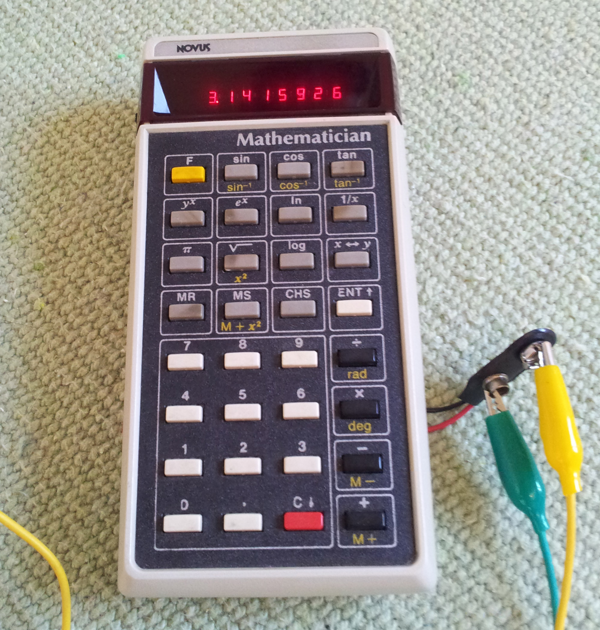
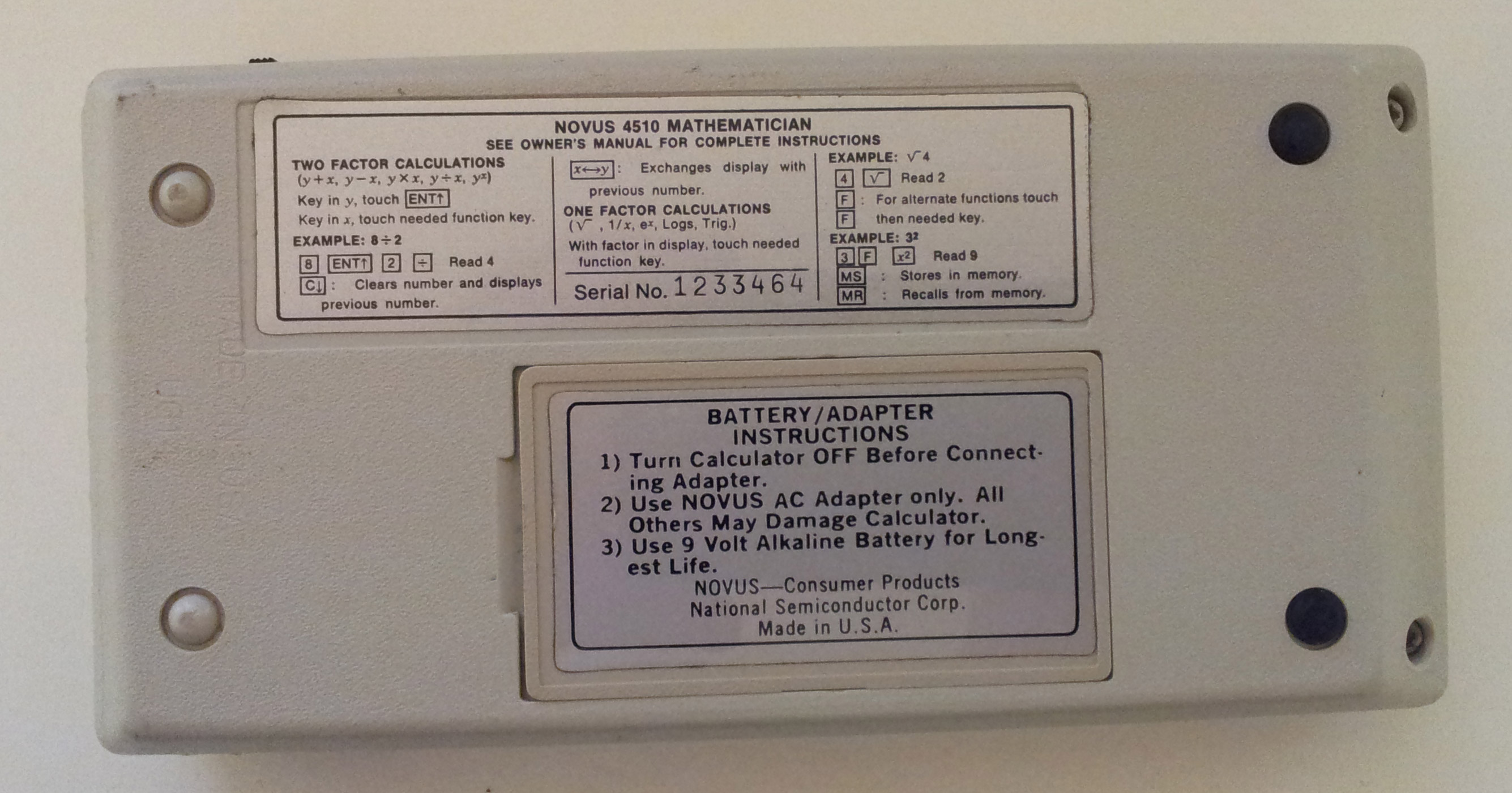
Novus 4510 Mathematician
A friend gave me this National Semiconductor Novus 4510 Mathematician scientific calculator made in 1976, and I couldn’t resist taking it apart.
It is an interesting calculator, simply by being a Reverse Polish notation (RPN) machine.
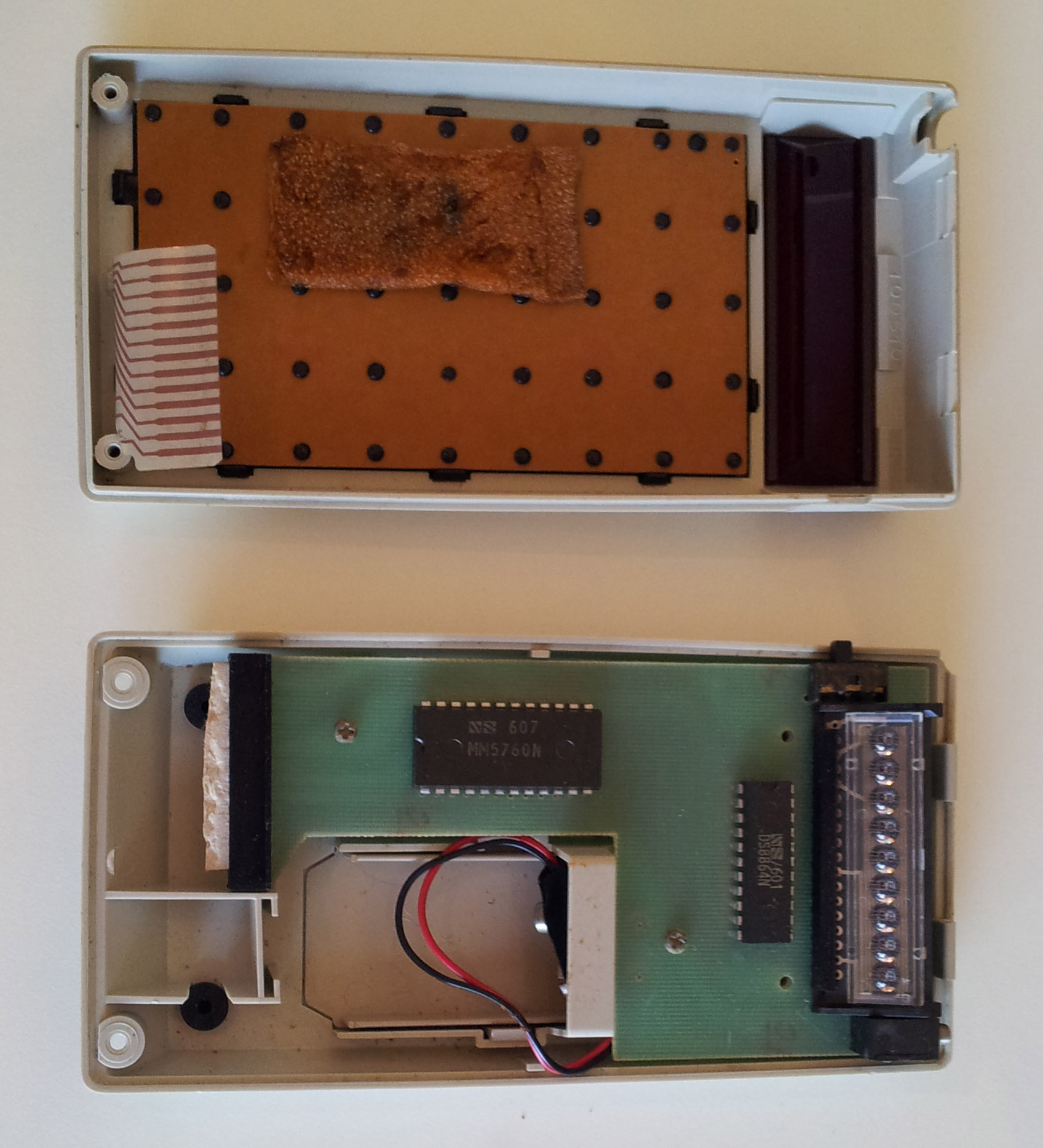
On the inside, the hardware it’s pretty simple, with only two IC’s and a 9-digit 7-segment bubble LED display, mounted on a single side fiber glass PCB. The keyboard seems pretty robust and it’s fixed to the front part of the case, while the PCB it’s mounted on the back part of the case, connected through a flat flex cable.
IC1: MM5760N – 24 pin DIP, Slide Rule Processor
IC2: DS8864N – 22 pin DIP, Segment-Digit Parallel-Input Display Driver
Simple HTML5 placeholders fallback for IE9 and older
I hoped I will never hear about IE9 and its lack of support for the placeholder attribute, … I had high hopes.
I’ve boiled a simple fallback, late in the evening and in a rush, using IE conditional comments for browser detection.
<!--[if IE 8 ]>    <html class="ie8 lt-ie10"> <![endif]-->
<!--[if IE 9 ]>    <html class="ie9 lt-ie10"> <![endif]-->
<!--[if (gt IE 9)|!(IE)]><!--> <html><!--<![endif]-->
$(document).ready(function() {

	// HTML5 placeholders fallback for IE9 and older
	if ($('html').hasClass('lt-ie10')) {

		// add the placeholder text as value
		$('textarea, input:text').each(function() {
			$(this).attr('value', $(this).attr('placeholder'));
		});

		// clear form fields on focus
		$('textarea, input:text').on('focus click', function(){
			if (this.value == this.defaultValue) {
			this.value = '';
			}
		}).on('blur', function(){
			if (this.value == '') {
			this.value = this.defaultValue;
			}
		});
	}

});
Random start cycle
function randomBox(randomItem) {

  randomItem = $(randomItem);

  var random = Math.floor(Math.random() * randomItem.length);

  randomItem.eq(random % randomItem.length).addClass('active');

  function startRand() {

    var current = randomItem.parent().find('.active');

    if ( current.is(':last-child') ) {
      current.removeClass('active');
      current.siblings(':first-child').addClass('active');
    } else {
      current.removeClass('active');
      current.next().addClass('active');
    }

    setTimeout(function(){startRand()}, 2500);
  }

  startRand();
}

randomBox('.list > .item');
CSS target elements by partial class or ID name
This can simply be achieved using attribute selectors.
div[attr^="elem"]
// Matches any “div” with an “attr” attribute that begins with “elem”.
div[attr$="elem"]
// Matches any “div” with an “attr” attribute that ends with “elem”.
div[attr*="elem"]
// Matches any “div” with an “attr” attribute that contains the substring “elem”.
div[attr|='elem']
// Matches any “div” with an “attr” attribute that starts with “elem” and may continue with a dash (ex. “elem-string”).
Ex. target a “form” with the id=”login-[ID]-form” (where [ID] is a random form ID)
form[id^="login"]
// or
form[id^="login"][id$="form"]
// or
form[id*="login"][id*="-form"]
// or
div[id|='login']
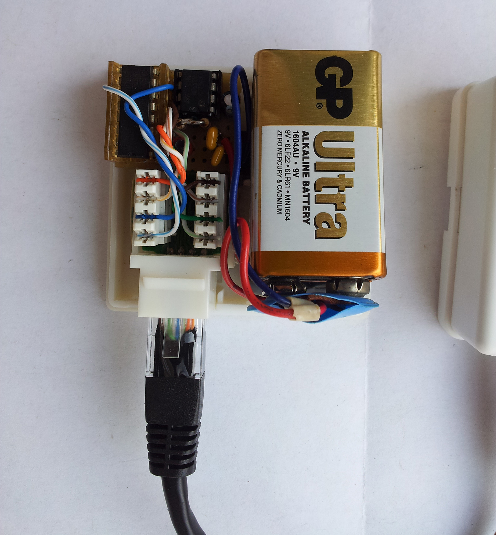
Network cable tester
Build a network cable tester with just two cheap integrated circuits and a few parts from the ‘junkbox’.
This cable tester, tests all the 8 wires in a network cable in one move, if one of the 8 LEDs does not lit up, it means that the wire corresponding to that LED is faulty.
You need:
- 1 x 4017 decade counter,
- 1 x 555 timer,
- 8 x LEDs,
- 2 x 8P8C modular connector (RJ45),
- 8 x 100Ω resistor,
- 1 x 10KΩ resistor,
- 1 x 15KΩ resistor,
- 1 x 4,7µF capacitor.
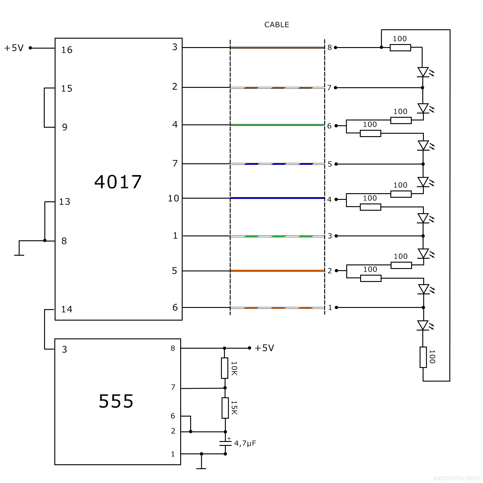
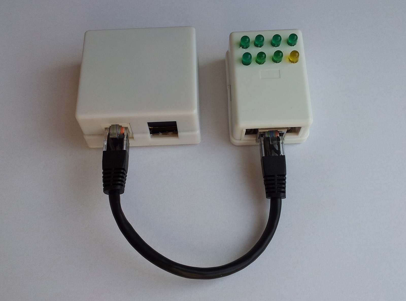
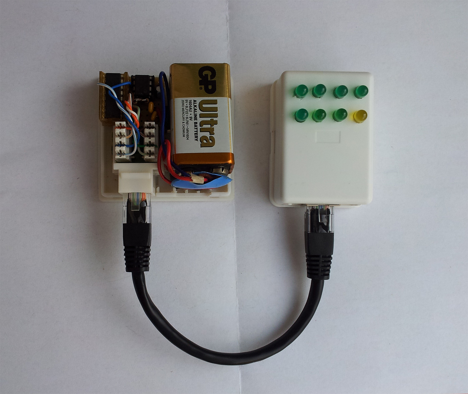
The yellow LED has no special significance, I only had 7 green LEDs.
A good ideea would be that every LED have the color of the corresponding wire, and maybe a switch for the T568A and T568B standards.
CSS propeller
Just for fun!
See demo CSS3 Keyframe Animation Propeller
(Do not open the demo page, if you do not tolerate high speed changing frames!)
<html>
  <head>
    <title>CSS3 Propeller</title>
  </head>
  <body>
    <div class="propeller"></div>
  </body>
</html>
.propeller {
  position: absolute;
  left: 0;
  right: 0;
  top: 0;
  bottom: 0;
  margin: auto;

  width: 0px;
  height: 0px;
  border-width: 200px;
  border-style: solid;
  border-color: #fff #00f #fff #00f;
  border-radius: 50%;

  -webkit-animation-duration: 0.2s;
  -moz-animation-duration: 0.2s;
  -o-animation-duration: 0.2s;
  animation-duration: 0.2s;

  -webkit-animation-name: rotateCircle;
  -moz-animation-name: rotateCircle;
  -o-animation-name: rotateCircle;
  animation-name: rotateCircle;

  -webkit-animation-iteration-count: infinite;
  -moz-animation-iteration-count: infinite;
  -o-animation-iteration-count: infinite;
  animation-iteration-count: infinite;

  -webkit-animation-timing-function: linear;
  -moz-animation-timing-function: linear;
  -o-animation-timing-function: linear;
  animation-timing-function: linear;
}

@-webkit-keyframes rotateCircle {
  from {
    transform: rotate(0deg);
  }

  to {
    transform: rotate(360deg);
  }
}

@-moz-keyframes rotateCircle {
  from {
    transform: rotate(0deg);
  }

  to {
    transform: rotate(360deg);
  }
}

@-o-keyframes rotateCircle {
  from {
    transform: rotate(0deg);
  }

  to {
    transform: rotate(360deg);
  }
}

@keyframes rotateCircle {
  from {
    transform: rotate(0deg);
  }

  to {
    transform: rotate(360deg);
  }
}
More on CSS animations you can find here:
https://developer.mozilla.org/en-US/docs/Web/CSS/animation
https://developer.mozilla.org/en-US/docs/Web/Guide/CSS/Using_CSS_animations
https://css-tricks.com/almanac/properties/a/animation
https://css-tricks.com/snippets/css/keyframe-animation-syntax
SASS sqrt function
There are times when a method of calculating the square root of a number is needed in SASS; for example calculating the sides of a right triangle, when the length of the hypotenuse is known, or the other way around, for a triangle mixin.
SASS provides us with some basic number operations, and there are libraries which implement more advanced math functions, but I wanted to experiment.
Using Newton’s method algorithm from Wikipedia, transcribed in SCSS scripting, we get the following:
@function sqrt($r) {
  $x0: 1; // initial value
  $solution: false;

  @for $i from 1 through 10 {
    @if abs(2 * $x0) < 0,00000000000001 { // Don't want to divide by a number smaller than this
      $solution: false;
    }

    $x1: $x0 - ($x0 * $x0 - abs($r)) / (2 * $x0) !global;

    @if ( abs($x1 - $x0) / abs($x1)) < 0,0000001 { // 7 digit accuracy is desired
      $solution: true;
    }

    $x0: $x1;
  }

  @if $solution == true {
    // If $r is negative, then the output will be multiplied with <a href="http://en.wikipedia.org/wiki/Imaginary_number">i = √-1</a>
    // (√xy = √x√y) => √-$r = √-1√$r
    @if $r < 0 {
      @return $x1 #{i};
    }
    @else {
      @return $x1;
    }
  }
  @else {
    @return "No solution";
  }
}
Which works, but looks too complicated.
We can simplify it into,
@function sqrt($r) {
  $x0: 1;
  $x1: $x0;

  @for $i from 1 through 10 {
    $x1: $x0 - ($x0 * $x0 - abs($r)) / (2 * $x0);
    $x0: $x1;
  }

  @return $x1;
}
Note: By default SASS computations are done with a precision of 5 decimals, if you need a higher precision use the “–precision N” (where N is the number of decimals) flag when compiling.
Get the closest next or previous integer in a sorted array of integers
// array = sorted array of integers
// val = pivot element
// dir = boolean, if true, returns the previous value

function getVal(array, val, dir) {
  for (var i=0; i < array.length; i++) {
    if (dir == true) {
      if (array[i] > val){
        return array[i-1] || 0;
      }
    } else {
      if (array[i] >= val) {
        return array[i];
      }
    }
  }
}
Example:
array = [0, 5, 7, 9, 22, 27];
pivot = 11;

getVal(array, pivot);        //returns 22
getVal(array, pivot, true);  //returns 9
Threshold voltmeter
This is not an actual voltmeter, it just “detects” if the input voltage is below or above a certain threshold. The threshold voltage is the breakdown voltage of a Zener diode.
I have seen this in a magazine described as an rudimentary car battery voltage indicator, recently I have used it as a protection circuit, just replaced the red LED with a relay, acting like a switch (closed when the voltage is under the threshold value and open if the voltage is grater).